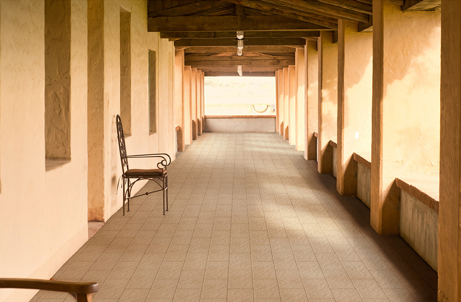
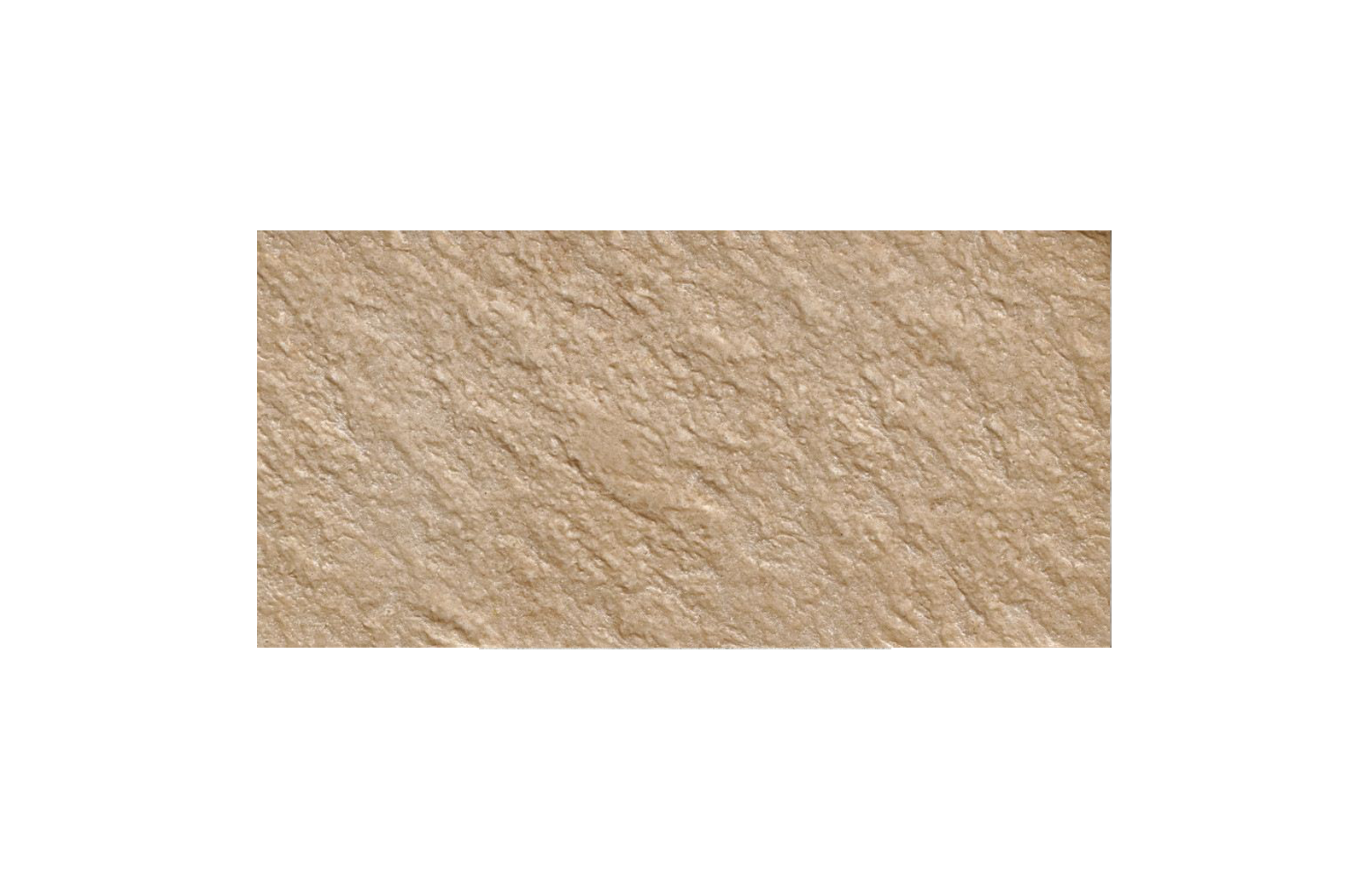
back to top
CLASS TILE BY GALILEO GRAN SASSO
'Gransasso Beige
 
 
CLASS TILE BY GALILEO | GRAN SASSO
Gransasso Beige
COLOURS & STYLES
BACK
THE STORY
Gran Sasso tile collection reinterprets natural stone with remarkable accuracy. Available in four neutral colours to suit each and every design needs.
MATERIAL
Glazed Porcelain Tile
APPLICATION
Floor
Wall
Slip Rating
R11
COUNTRY OF ORIGIN
Italy
VARIATION
Shade and Veins Variation (V1)
AVAILABLE DIMENSIONS
(L)300 × (W)150 mm
FINISH
Structured
Slip Rating
R11
FINISH
Structured
you may also be interested in
Nordic Wood
Nordic Wood tile collection enhances all the visual and tactile details of the natural material: oak. The large knots and intense woody shades are amazingly realistic and rewrite the poetry of ceramics with harmony and authenticity.
Vetri
Glass is a material that offers intrinsic clarity and harmony, distinguished by its very own duplicity: transparent and matt, fragile and at the same time sturdy. A study of this material led to the creation of the Vetri tile collection. Backed by the most sophisticated manufacturing technologies, Ceramiche Refin has developed its own research which is expressed in the creation of original surfaces with a notable innovative personality.

Vetri is a porcelain tile collection with a strong identity: the delicate colour variations that mark the edges create a surface with an unprecedented depth and an elegant geometrical mesh. The glossy finishing reflects and emphasises light, lending its surroundings brightness with evergreen charm.
Splendours
Splendours from Equipe features the wall tile collection in the ever classic 15x15cm in blue. The collection is suitable for bathroom and kitchen wall application.
Graph
With its micro patterns and colour contrasts, Graph tile collection makes its mark on any room. At the same time, its discreet design makes it easy to pair with other materials and furnishings. The collection can be matched with coloured grouts to create countless combinations suiting every environment in which Graph is to be used. Because any interior design should encompass materials that "speak" and "listen" to one another, in true Ceramica Vogue style.